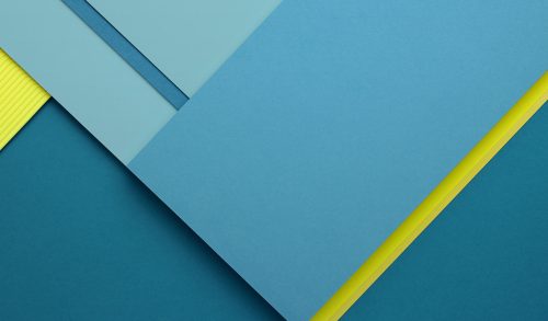
Google’s Chromebooks get a small makeover. Literally.
If you’re an owner of a Chromebook, you and I both know that there’s nothing you can really do to customize the appearance of it.
Unlike Windows, you can’t really change how the windows look, the color of the menu icons and bars, and the animations of maximizing and minimizing stuff.
On Chrome OS, your customization options are very limited. You can only change a few things that can give it some personalization.
Specifically, I’m talking about the background on your desktop. Also known as the wallpaper.
Last updated: 7/10/17.
The previous default Chromebook wallpaper
Google has always shipped them with a default image for the longest time, but recently, they’ve changed it.
They always had a simple material design image, while some models used those provided by their manufacturer. For those who don’t know what material design is, it’s basically eliminating layers and making everything flat so mobile users can navigate easily, in a very blunt way.
It was a simple picture a shoreline beach with some rocks. Sorry for my awful description.
Note that it really depends on when you got your laptop to judge which picture is considered to be the “default” one. It also matters what manufacturer made your laptop as well. HP, Samsung, and Acer all have their own wallpapers.
This was the default image for me when I logged onto my Acer 11 CB3-131:

And this was one of the reported material design wallpapers:

Although there were a ton of others you could select from as well.
[the_ad id=”2505″]You could choose other beaches, snow, seasons, and more. Pretty much a whole bunch of generic nature scenery. You know I mean- the stuff that’s pretty to look at but you don’t really ever see in person. Those perfect nature shots where everything is just beautiful.
(If you like pretty nature scenes, there’s an app for that which shows you a new nature image when you open a new tab).
Here’s another image that you can use that’s pre-loaded onto your laptop:

And here’s one found on HP Chromebooks:

The new default Chromebook wallpaper
[the_ad id=”2477″]Now, in the Chrome OS has changed it to a new default look and it’s being shipped out for newer Chromebooks.
In the newest update to the Developer Channel (which you can easily access), the new background is also similar.
It’s simple and looks similar to Samsung’s OEM image on their Chromebook Plus, but it’s not exactly the same.
It has a nice blue tone that looks like waves of paint, or something like that. It features a single wave that creases through the middle of the image, with lighter blue shades on top and darker blue on the bottom. It seriously looks like an ocean or something of the sort.
This is the new wallpaper:

I’m far from being artsy, so please don’t critique my critique.
It’s been reported that this is the new image for Android as well on their Pixel phones. Perhaps it’s just being moved over to Chrome OS for a universal default so users can feel at home.
It’s simple and it works, but I suspect that many will want something a little fancier and tasty.
Try it out for yourself
If you want to see the default Chromebook wallpaper, you can simply do the following:
- Head on over to the Developer Channel on your laptop
- Find the background image choose by right-clicking on your desktop background image
- Choose the default image and see it in its full glory
Another direct alternative is to simply go to the following location via Chrome web browser (without the quotations):
“file:///usr/share/chromeos-assets/wallpaper/default_large.jpg”
Note that you don’t have to be on the Developer Channel to personalize it. You can easily change your Chromebook’s wallpaper or theme no matter what channel you’re on (Developer or Stable). You can even pick your own custom images rather than the provided ones by Google as well.
So…why material design? What is it exactly?
All in all, this is a step into Google’s world. Material design is a language created by Google back in 2014 which consists of using a grid-based layout which stems from the “cards” debut. You can read about it in-depth here.
Using a grid, cards are placed in an eye-pleasing layout along with smooth transitions, drop shadows, border, and padding effects. If you look at Chrome OS, Google’s knowledge base, or pretty much any sites created by Google, you’ll see that their whole UI is coded this way.
A typical layout is where the page is divided into different “sections” each with some kind of “card” that represents some information.
Take a look at your Settings page by going to “chrome://settings” and just browse through the page.
You’ll see that there’s a plain gray background, cards with information presented in subsections, and all the buttons have some depth and animation to them.
After all, Google is a dominating force and has done the research on creating an effective UI, so it only makes sense for other to follow suit.
I’ll keep posting about this as any changes occur. It’s pretty interesting to see one company reshape the look and appearance of the Internet.


My arm hurts kind of but not really.